
In the world of fashion, we can say there are only a few brands that can give off that African and modern tailoring everyone craves for, and that’s where Kenneth Ize comes in.
Kenneth Ize creates outfits that connect emotions through fabric. And trust me, not all brands do that.
Their styles and designs don’t just have West African heritage; they also make it structured and easy to the eye.
Words around keep associating the brand’s works with outfits that hold their body figure perfectly without stress, while giving an idea of who they are, without them introducing themselves first.
Now here’s the question that’s on everyone’s lips: ‘Will this A/W 2026/27 collection live up to the very high standards that the previous collection has set?’
This article is here to answer every what-if.
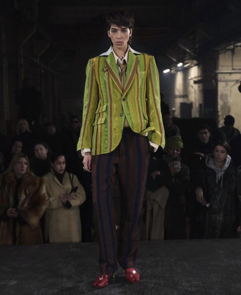
Omo, the first outfit is here.
So, starting this outfit is a Lime-green suit, and everyone knows how eye-catching Lime-green colour is.
Anyone putting on a suit doesn’t need to stand on a stool to introduce themselves before the room knows they’ve arrived.
Coming to the styling. I just love how the two buttons and the sharp label are positioned. Like it looks common, something one can find on a regular suit. But the thing that makes it just pop is how it complements that masterpiece of a necktie and the high collar shirt.
And that’s not all o. If there is one other thing that can be pointed out as this outfit’s MVP, then it would be the shimmering finish of the textile. Now, that’s something to talk about. There’s that signature Kenneth Ize handwoven aso-oke written all over it, which is just so hard to ignore.
For a guy looking for where to wear this outfit after purchasing it, look no further.
This complete piece would perfectly fit the Alte dress culture.
Everything about it just fits the unorthodox self-expression perfectly. It just gives a break from the boring grey suit we’ve all been seeing.
I can also see the JOY motto for this collection, all over this piece. The shimmery fabric and the bold stripes give the message that the brand is trying to share with the public, which is that Joy is an active voice that refuses to quiet down.
Still, it’s one thing for an outfit to look good, but then, it’s another to stay relevant to the industry.
Talking from the industry perspective, the piece checked the boxes for having a level ground on craftsmanship and luxury. Still, the high-contrast stripes and shimmer might be overwhelming for many who want to purchase it, and that’s where Kenneth Ize needs to work on.
They can easily expand the market reach by giving this piece a completely different coloured pair of trousers. Doing this will not just give this collection the global reach it deserves, but could also bring in luxurious customers. And who doesn’t want that?
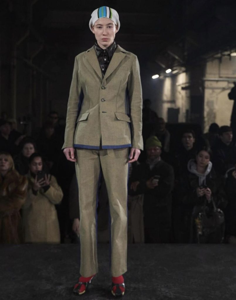
Now, for this one, Kenneth Ize is introducing us to a beige button suit that feels distinct because of the blue piping along the side seams and hem.
If there is an MVP, I’d easily go for the jacket. The cinched waist cut gives that slim silhouette most guys want when putting on a suit. And when paired with trousers that just follow the same clean vertical lines, then it’s heaven on earth.
Another thing that makes this outfit stand out from other standard suits everyone has been used to is the styling. Now, I’m not talking about the styling on just the outfit alone, no. I’m also talking about how it makes the silhouette perfect. It gives off that manly hourglass shape.
The styling a simple reflection of the Hybrid trend that is growing rapidly. Is it the cap that is giving off a casual street element? Abi, it’s the way it collaborates well with the high-fashion tailoring of the suit.
It simply reminds me of brands like Orange Culture. A brand that is just known for erasing the lines between masculine and feminine looks.
Now, how does this speak to the brand’s motto? The beige colour to me seems to be representing sparks of joy, and who doesn’t want that?
When it comes to the commercial aspect of things, this look is my number one. Like, it just satisfies the need to have a trendy look when one feels like it. Still, this suit looks too tight. A lot of people just want their breathing space when putting on an outfit. The designers can widen the trousers’ legs slightly. Now, doing this would bring in more potential customers.
Now for the next piece. This olive-drab and button-down shirt is just everything. What surprised me upon seeing it was the massive gingham scarf in shocking pink and cobalt blue.
The scarf doesn’t look like an accessory. Wrapped around the torso provides that warmth and a sense of emotional protection. And that alone speaks to the brand.
The lower half is made of the most experimental trousers I have ever seen. Is it the hybrid design for me? Even the lime-green shimmer flap layer also stands out in its own way without being overshadowed.
Everything just gives off that radical luxury.
Yes, to some, this piece may or may not look funny. But when looking at it from a different angle, it challenges traditional menswear silhouettes.
It just embraces the soft texture like the fringed scarf and then pairs them with the hard shimmer of the trousers.
From the market viewpoint, these double-layered trousers might be too complex and difficult for others. The only way to appease everyone is to add the lime green as a side-stripe or even a singular pocket detail, which can help improve the entire outfit. It would maintain the JOY story while making this accessible to the wider public.
Now for the black and black. This just reminded me of the Saja Boys in K-pop demon hunters.
This outfit includes a wide-wear collar. Not just that, it also has several details like the oversized cargo pocket and the white denim belt that increase the style to a whole different level.
Now, to be honest, this belt adds definition to the waist, one that is very much needed.
Another area to acknowledge is the raw finish.
I will start with the white stitches. There are still visible along the hem pocket. And it gives that unfinished look that gives the outfit a curious edge.
The shredded work-in-progress appearance is just so fly.
This piece could be put under street-luxury, and that is because it just appeals to the growing audience. There is storytelling to it.
But the shredded edges might push away luxurious customers.
And to ensure this from happening, the brand just has to offer a finished version of the trench coat. They should just maintain the striking black-and-white colour, but with a polished hem for a classier look and better audience reach.
Finally, here is the last piece I’d be talking about.
For this one, there is a charcoal black outfit with a crushed velvet tunic, a square cut neckline and a relaxed extended sleeve. Now all these details are giving.
This fabric is thick and rich, which gives an impression that even materials or outfits can be luxurious and protective at the same time.
What captures my eyes the most is the red belt cinched at the waist. It just breaks the whole monochromatic look that the outfit was given.
And the most striking feature of this is the aso-oke headdress. That drapes down like a veil.
Now, is this good enough? For me, no. There are some things the brand would’ve done better.
This dress reveals very little of the silhouette. Like a person could wear it and it wouldn’t give them the shape they wanted. The outfit has a lot of space, and to be honest, it wouldn’t be suitable for everyday wear.
What can Kenneth Ize do then? I’d suggest that they create a shorter jacket for the velvet tunic. I believe this would bring this beautiful piece to more potential buyers.
All in all, I’d say this collection is a master piece. It just shows how materials describe emotions perfectly.
Every piece is displayed to show how dedicated the brand is. They express individual and cultural heritage. Is it the material dialogue or what? This collection creates it perfectly well, not just for the wearer but also for the observer.
The brand has proven to be relevant in the fashion industry, and there is no denying that at all. The collection is unique. Not just that, it is also forward-thinking as well.
Kenneth Ize just needs to take note of the considerations to make a better global reach and make the silhouette more adaptable.


By Chinazam Ikechi Uko